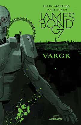
In Warren Ellis and Jason Masters’ “James Bond” #4, Bond’s struggle against two very different opponents dominates the action. There is very little characterization, but that’s not a huge surprise. Just like in the films, Bond is a known quantity; the suspense lies in seeing how he matches wits and resources against his foes.
The story is divided into four parts: prelude, fight, conversation and silence. Masters’ transitions are excellent and the components fit together well visually, while preserving their independent foci.
The short opening sequence is an excellent introduction. Here, Bond is the most himself and the least interchangeable with any other spy or action hero. He’s suave, smooth and in control. The dialogue is functional and spare throughout, but — in this scene — it is also understated and funny.
The tableau that greets Bond and the reader upon entering Kurjak’s building is successfully shocking despite its lack of originality. Masters’ composition and pacing are excellent. His interiors also have excellent detail and depth.
Masters’ artwork has many strengths, but at least one obvious weakness. His facial expressions and body language are terribly stiff, so much so that they pull the reader out of the story and don’t complement Ellis’ dialogue in expressiveness or timing. Clothing also doesn’t drape naturally on characters’ bodies.
However, the extended fight sequence that occupies a third of the issue has much to relish in: lots of energy, rapid movement from panel to panel and even a balletic grace in the action lines, composition and perspective. Unfortunately, the stiffness of limbs and imperfect anatomical proportions hold Masters’ work back from being great here. The scene in which Bond grabs onto his opponent’s thighs is especially awkward-looking. The two men look like statues frozen in midair. What’s more, Bond’s legs are too short and his trousers are too tight. The tilted perspective and panel design are exciting and forward-moving, but they can’t make up for the woodenness of the figures.
The moment of victory/defeat is wonderful, especially Masters’ dramatic shading and the change in Guy Major’s colors. Masters’ facial expressions are at their most effective here, but the drawn-out goriness of the interrogation is over-the-top. Ellis has two neat plot tricks wedged into the climax of the action. Both the idea of using ahedonia as a weapon and Bond’s attack on that advantage are clever.
Unfortunately, the most important plot twist falls flat. Bond’s next interaction is mostly verbal, a good change in pacing from the intense physical struggle. However, the revelation of Dr. Kurjak’s past and his little speech about the beauty of “controlled experiments” made me roll my eyes. The villain is given no dimension to raise him above the level of cliche. Obviously, he’s doomed to fail just by being opposite Bond, who represents England with its stiff upper lip. There’s some smug nationalism at work in the idea that “it can never happen here.” The ridiculous folly of the villain’s scheme (why choose England over any other island) and the certainty that England will prevail over fascist pigs prematurely kills the suspense in “James Bond” #4. It doesn’t help that Masters’ facial expressions are uniformly unconvincing and off throughout the conversation, especially for Dr. Kurjak.
“James Bond” #4 becomes almost silent for the last three pages in another change of pace. Major’s use of red amplifies Bond’s stress in his race against time, but he overdoes it and the monochrome flattens Masters’ linework. The abrupt cliffhanger leaves an unspecified threat lingering off-panel, and this was more refreshing than confusing.
Ellis’ take on Bond still works well, but the villain’s introduction falls flat.

